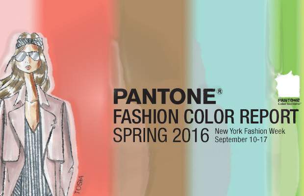
I am a bit late with a review of Trendy Colors Spring Summer 2016 which were presented by Pantone Color Institute™. It's not too late, anyways, so here I am with my blog post.
First of all, I will traditionally write a few words from myself. I'll tell you about the color trends in general, and what colors I like the most.
It's interesting: despite the fact that designers tend to take the best from modern industry, high-tech and industrial development, in choosing colors for their collections artists paradoxically run away from the "civilization", or rather, from the rapid flow of the modern life. Even in summer, the season of bright colors, we can observe the predominance of the colors, which have rather a calming, relaxing effect on the psyche.
Colors this season transport us to a happier, sunnier place where we feel free to express a wittier version of our real selves.Leatrice Eiseman
Executive Director, Pantone Color Institute™
Another noteworthy point: the Pantone Color Institute united masculine and feminine palettes, creating the second in the history unisex palette. Whatever may be said by opponents of self-expression and the conservatives of any kind, humanity as a whole tends to equal conditions and opportunities for people of either sex. This is evident even in such seemingly small things, like choosing a color of clothing. Remember, a decade ago, how often did you meet men in pink shirts? Now it is more than normal thing. Even in Russia, lol. I'm happy! Long live the social singularity!
In the upcoming season elegant Cadmium Orange and serene Cashmere Rose, trendy colors Fall Winter 2015/2016, will be replaced by more fresh and energetic Peach Echo, Fiesta and Rose Quartz.
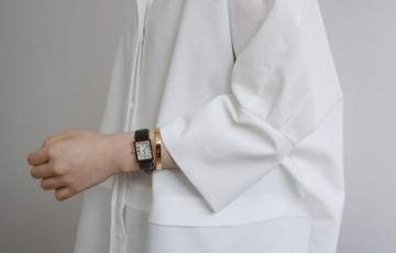
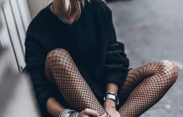
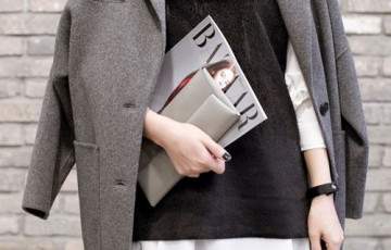
I was pleasantly surprised by the presence of а gray shade in the summer palette - and not simply gray, but the one with my favorite purple subtone: Lilac Gray. As a huge fan of futurism, I like that very much much, since my wardrobe is full of gray garments :D
The soothing, calming nature of colors in the Spring collections are led by Rose Quartz, a persuasive yet gentle tone that conveys compassion and a sense of composure. Like a serene sunset, flushed cheek or budding flower, Rose Quartz reminds us to reflect on our surroundings during the busy but lighthearted spring and summer months.
The fashion and design communities, and consequently, consumers, have been in love with orange for several seasons. Coming to the fore this Spring is Peach Echo, a shade that emanates friendlier qualities, evoking warmth and accessibility. It is an all-encompassing, tempered companion in the playful orange family.
Weightless and airy, like the expanse of the blue sky above us, Serenity comforts with a calming effect, bringing a feeling of respite even in turbulent times. A transcendent blue, Serenity provides us with a naturally connected sense of space.
A maritime -inspired blue, Snorkel Blue plays in the navy family, but with a happier, more energetic context. The name alone implies a relaxing vacation and encourages escape. It is striking yet still, with lots of activity bursting from its undertones.
While the majority of the Spring Summer palette trends toward calmness, a few diversions from the theme emerge that offer a contrast. With Buttercup, designers reveal a shining beacon transporting its wearer to a happier, sunnier place.
A shade of aqua that leans toward the green family, Limpet Shell is clear, clean and defined. Suggestive of clarity and freshness, its crisp and modern influences evoke a deliberate, mindful tranquility.
As in most any season, the need for neutrals arises. Essentially a basic, the subtlety of the lilac undertone in Lilac Gray, adds a distinctive edge to thу fundamental gray spectrum.
The high energy Fiesta is a harbinger of excitement, encouraging free-spirited exploration to unknown but welcoming locales. A strong and fiery, yellow-based Red, the vivid Fiesta provides a stark contrast to the calming, softer nature of this Spring - Summer 2016 season’s palette.
A transitional color that will take us through the seasons, Iced Coffee manifests as another strong neutral for the season. With its natural earthy quality, the softness and subtlety of Iced Coffee creates a stable foundation when combined with the rest of this season’s palette.
Green Flash calls on us to explore, push the envelope and escape the secular life, radiating an openness that combines with the rest of the palette in unexpected but serendipitous ways. The popularity of this shining hue is representative of nature’s persistent influence even in urban environments, a trend continuing to inspire designers.